The Viewer Responds: Art and Perception
Virtual exhibition created by students in “Psych-349 / Music-321: Art, Music, and the Brain,” co-taught by Mara Breen (Associate Professor of Psychology and Education) and Adeline Mueller (Assistant Professor of Music), Spring 2020
In collaboration with Ellen Alvord
Designed by Nina Frank
mh_1987_2_v1_01-975x850.jpg

Laura Shea - VIEW OBJECT DETAILS
INTRODUCTION
“You have a painting. That painting is not complete until the viewer responds to it. [...] When you look at a painting, you are undergoing a creative experience that is, at least in outline, similar to the painter. The painter exercises a dramatic amount of creativity in doing a portrait. But you yourself generate a fair amount of creativity in reconstructing it in your head, and reconstructing it in a way that is unique for you and slightly different for me.” - Eric Kandel, “How Your Brain Finishes Paintings” (Big Think, 2013)
In the art portion of this course, we use our interactions with visual art to learn about vision and perception. We identify the specific tools that artists use to induce the viewer’s perception of light, form, color, and depth, and we learn how these features are processed in the brain. In addition, we explore the role of our prior experiences in the processing and appreciation of art, meaning that we mostly see what we expect to see. The influence of experience on perception applies both to low-level perceptual features of luminance and contrast, color, patterns, form, and depth, and also to more complex objects like faces, landscapes, and abstract art.
At the end of the semester, we explore how low-level features and high-level expectations interact in our perception of abstract art, where we are faced with images that are unlike the objects and scenes that our visual systems evolved to process. In our interaction with these pieces we reflect on the way that perception of abstract art becomes an individualized experience, as it requires the viewer’s interpretation based on their prior experience, and how this process can sometimes engage the viewer’s emotions more deeply than figurative art does.
Our hope as instructors is that students leave the course with new knowledge about the operation of brains and minds, as well as a deeper appreciation of the power of visual art to evoke emotional responses.
Mara Breen
Associate Professor of Psychology and Education
and
Adeline Mueller
Assistant Professor of Music
LUMINANCE AND CONTRAST
Luminance is defined as the amount of light emitted from a surface. Although correlated with brightness, it is not the same thing, as objects with the same luminance can be perceived differently depending on local contrast.
Miel Marwah '20
 When looking at Dale Chihuly’s Clear and Gold Tower (2013) in daylight, the inner parts of the branches (which are closest to the center) look yellow in hue. The outer branches appear more white-ish and silvery, since there is less layering of glass at the edge and we are able to see the individual glass color. However, at night our perception of the glass hues changes because of the lack of bright sunlight. The negative space created in between the curves of the branches becomes a lot clearer. This is connected to the idea of lateral inhibition, where ganglion cells have an “on” and “off” area; when light hits the “off” area, the ganglion cell sends inhibitory information, but when light is on the “on” area, the receptive field sends excitatory information. This gives us a boost in perceiving edges since there is more activity in the boundaries.
Jaey Yim '20
 In Self Portrait with Cat (1925), Léonard Tsuguharu Foujita uses the concept of luminance to create a feeling of depth. When you look at the artist's shirt, the small variances in blue have different luminance from the dark crease lines, allowing us to read it as three-dimensional. Also, Foujita uses two colors with different luminance to allow the viewer to see the hair as an overall color as well as make out individual strands represented by vertical lines arranged across the hair. After the luminance activity we did in class, I now wonder if Foujita deliberately chose colors that have different luminance, so that the background color of the hair and the vertical lines can be seen and not be engulfed by each other due to similarities in color.
COLOR
Color is a property of our minds, and, like brightness, is affected by context. This means that two objects can be perceived as different colors even if they are physically the same.
Meg Renzelman '20
 Josef Albers' color studies in his book, The Interaction of Color, focuses on the relationships and perceptions of color. In this color study, the two small squares appear to be vastly different hues of orange. The square on the blue background looks lighter and more peachy-orange, while the square on the orange background, appears to be darker and tan. In actuality, the two squares are the same color. We read it in this way because of the influence of the surrounding background colors and the other two center colors that touch edges with the squares. For this reason, painting "accurate" colors can be difficult. The colors we perceive violate our expectations of what a color can be in a certain context, so if you were to try to mix paint to match what you perceived of right-hand square color in Albers image, the result would be much lighter.
PATTERNS, FORM, AND DEPTH
Our visual systems have evolved to prioritize the perception of patterns and form over details. In addition, we learn cues from our environments that allow us to see depth and figure/ground relationships even in two-dimensional scenes.
Sue Feng '20
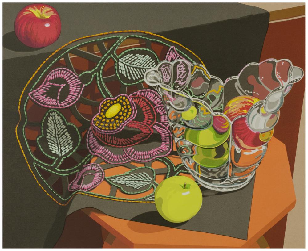
 In Openwork by Sondra Freckleton (1986) it is difficult to discern the number of apples in the glass container. One reason for this is a concept called edge detection. People perceive a border by the differences in the lightness on the two sides of the object. This phenomenon results from lateral inhibition—our light receptors on the lighter side of the edges are more excitatory than the receptors on the darker side. For example, in the glass where there appears to be one or more green apples, the top side of the edge is a thin light green stripe, and the downside is a grey one. The edge prompts us to judge that the two images on both sides of the border are from two separate objects. Another reason for this confusion is that what can be seen through the glass is refracted. In our daily life, we see most objects positioned vertically or horizontally, like the two apples not in the glass, which allows us to assume that they are real apples. However, the view of apples through the glass layers is slanted, preventing us from processing their forms and making a judgment about their realness.
Ali Griffin '20
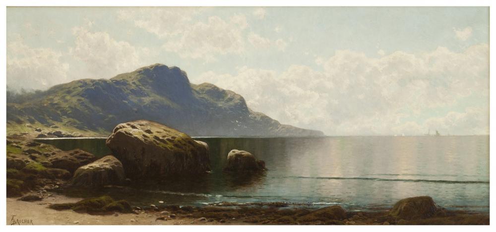
 The ability to layer learned knowledge on top of new sensory input is how we can perceive three-dimensional depth and dynamicity from two-dimensional artwork. In this oil painting, Grand Manan (1885) by Alfred Thompson Bricher, the artist questions our indirect perception by creating a realistic landscape on a two-dimensional surface. While our direct perception perceives horizontal and vertical lines of varying shades of blue and brown scattered throughout the canvas, our indirect perception can identify something recognizable—like the sand at the bottom of the image. Bricher creates depth and distance by making objects that are "farther away" smaller in size and lacking clarity. He also uses brush strokes to evoke detailed textures such as ripples in the water, an unevenness in the rocks and mountains, and grainy sand. When combined, these effects further my perception of reality and allow me to draw from my knowledge of the elements of a real shoreline, leading me to read the two-dimensional painting as a three-dimensional landscape.
Priya Basu '20
 Stephen Hannock’s Twilight Over the Oxbow: The View from Mount Holyoke (2019) intentionally plays with the visual system. When looking at the line of trees near the center of the painting, they cast a dark shadowy reflection over the water. When you look more closely at this detail you can see that Hannock inserted images of cellists—which resemble the tree shadows from afar. This phenomenon of perceptual assumption is exemplary of Bayes’ Rule, which states that the probability someone will perceive something a certain way is based on present stimuli as well as what that person has experienced in the past. Thus, the fact that we overlook the incorporated text and images when viewing this painting could be attributed to the fact that humans primarily encounter nature untouched by such illusions.
ABSTRACT ART
Abstract art represents views that we don’t see in the natural world. Because of this, abstract art presents opportunities to understand how our perceptions depend on context and individual experiences.
Honami Tanaka '20
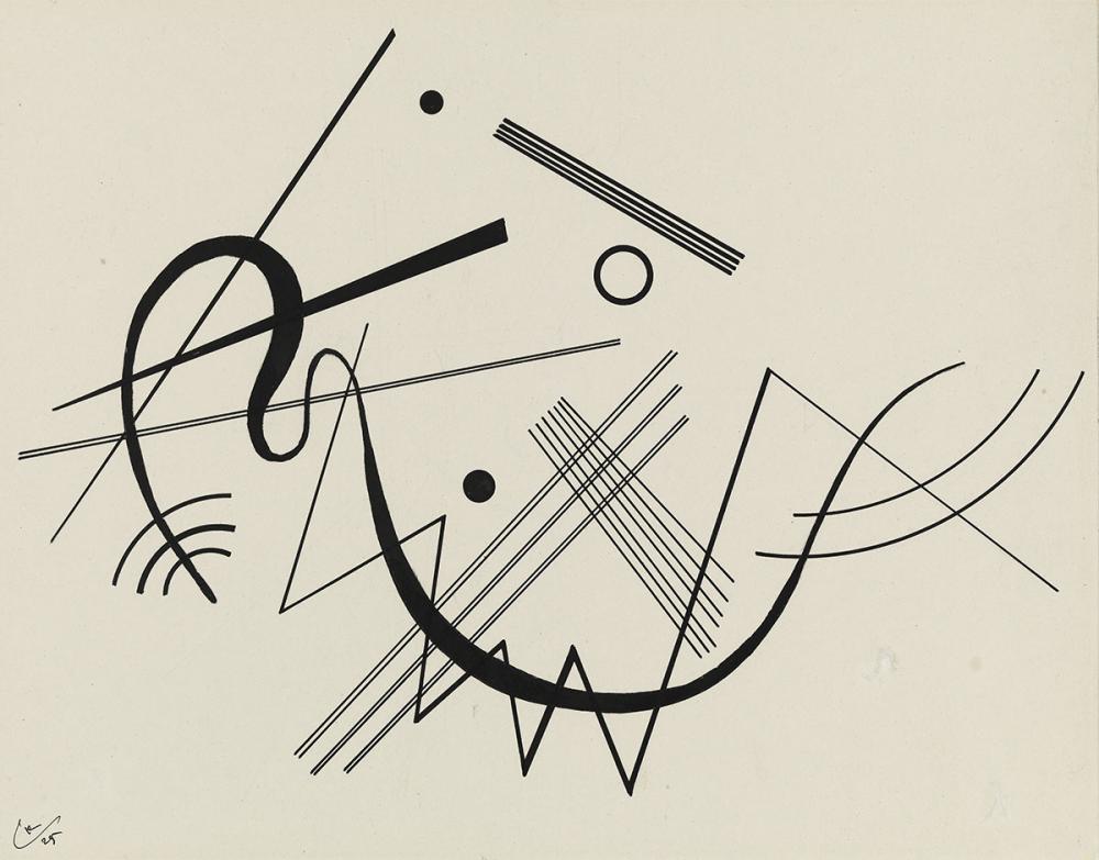
 While there is no clear interpretation of what Kandinsky is depicting in Untitled (1925), the artist evokes depth through scale and by establishing figure and ground. When you compare the two black dots that are aligned vertically, the one on the bottom is larger in size which makes it appear closer. There are also few ambiguous vanishing points in the painting, which adds to the depth effect, albeit in a confusing way. Some lines seem to vanish into a point in the top-right corner, while others seem to converge at different points. The change in thickness in the big swirl in the middle creates a three-dimensional effect, where the line looks like a piece of ribbon.
Xin Yu Zhang '20
![Jacques Villon; Marcel Duchamp, "La Mariée [The Bride], 1934 Jacques Villon; Marcel Duchamp, La Mariée [The Bride], 1934](/sites/default/files/styles/image_1000_wide/public/mh_2003_24_2_v1-hpr.jpg?itok=RmI672tc) At first glance, Villon and Duchamps’s The Bride (1934) does not appear to depict a bride. There are solid three-dimensional shapes with realistic shadows, but if you look closely, these shapes do not seem to resemble any familiar objects. However, after knowing the title, you may start to make out a few body parts, faces, or elements associated with a human bride. This suggests that our understanding of visual perception may not be accurate because it is a top-down process. When you learn the title of this work beforehand, you immediately start to see and interpret the shapes as a bride; without knowing the title, the shapes remain abstract and meaningless.
At first glance, Villon and Duchamps’s The Bride (1934) does not appear to depict a bride. There are solid three-dimensional shapes with realistic shadows, but if you look closely, these shapes do not seem to resemble any familiar objects. However, after knowing the title, you may start to make out a few body parts, faces, or elements associated with a human bride. This suggests that our understanding of visual perception may not be accurate because it is a top-down process. When you learn the title of this work beforehand, you immediately start to see and interpret the shapes as a bride; without knowing the title, the shapes remain abstract and meaningless.

 Give
Give
